So, is your affiliate marketing website mobile friendly? If you don’t know then follow along as we look at different elements of your website to see if it passes the test.
 The definition of “mobile friendly” is quite simple – a mobile friendly website is one that displays correctly on mobile, hand-held devices like smartphones and tablets.
There are several important elements that make a website mobile friendly. Let’s look at these elements and, while reading, ask yourself how your own site measures up.
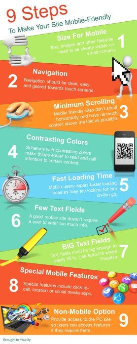
Sized for Mobiles
A site optimized for mobiles is easy to read on a small, hand-held device. Some mobile devices have screens that are as small as 1/5 the dimensions of a PC. That’s quite small and all of the text, images, and other features need to be clearly visible. The design elements of the site should be uncluttered and images should be kept to a minimum and large enough to see.

Mobile Navigation
A mobile friendly site is easy to navigate. Navigation on a mobile device is different from navigation using a PC. Mobile devices use touchscreens, which allow the user to tap, slide, expand, pan, and so on with thumb and fingers, whereas a PC uses a mouse. The small screen size makes a difference as well. Navigation should be clear and easy with buttons that are large and easy to tap.
Minimum Scrolling
Your site should be easily viewable with minimal scrolling. Mobile friendly websites don’t scroll horizontally like a PC website might and they usually put as much content as possible above the fold so that vertical scrolling is kept to a minimum.
Contrasting Colors
A color scheme that includes contrasting (but not clashing) colors is especially good for mobile sites. It helps to make a site easier to read on a mobile and call attention to certain content while it also makes the site more visually appealing.
Fast Loading Time
A mobile friendly site doesn’t have any elements that take time to load. Mobile users expect faster loading times and many users are looking for information on-the-go. Website elements that take time to load should be avoided or kept to a minimum. In addition, Apple devices don’t use Flash at all, so any videos created in this format won’t show up.
Few Text Fields
Your site shouldn’t require the user to enter a great deal of text. A PC’s keyboard makes typing text into forms and fields on a website very easy. It’s not so easy on most mobile devices. A good, mobile friendly site shouldn’t require the user to enter a great deal of text.
Big Text Fields
When there is text, fields are big enough to easily fill in. Whenever possible, mobile friendly sites use auto-fill, which remembers passwords so the user doesn’t have to enter them each time.
Special Mobile Features
It’s nice if your mobile friendly site can take advantage of the special functions of mobiles, like click-to-call, which allows users to click a phone number and it automatically calls the number. Another example would be features that use the mobile’s geographical location or social media apps. These features create a better experience for mobile users.
Non-Mobile Option
Another handy feature that enhances the mobile user’s experience is a link that leads to the PC site. If the user is used to accessing the PC site or there are special features or content there that they want, they can easily access it from the mobile site, even though their mobile browser automatically redirects to the mobile site.
Is Your Affiliate Marketing Website Mobile Friendly?
You can get some idea of how mobile friendly your site is by accessing it from a mobile device and seeing how it works according to the points above. Check out the visibility of site elements, the navigation, the loading time, and whether or not it requires a great deal of scrolling.
A better and more thorough way to check your site is to use the Google Developers Mobile Friendly test page.
Enter your main webpage URL into the field in the middle of the page and hit “Analyze.” After a few seconds, it will give you results. At the top of your results, it will tell you whether your site is or isn’t mobile friendly. Below this, you’ll find a simple report that explain why it is or isn’t.
The report is separated into three columns. The left-hand column explains problems with your website for mobiles. These might be things such as:
- Text too small to read
- Mobile viewpoint not set
- Links too close together
- Uses incompatible plugins

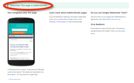
The center column shows how a Googlebot sees the page. Googlebots are Google’s web crawling spiders, which index websites. This column basically shows you what your site looks like on a mobile with a small screen.
The right-hand column gives you ideas on how you can improve your site for mobile. You first have to select whether you built your site using a CMS, someone built it for you, or you built it yourself. Once you make your selection, there are tips and options to help you improve your site. For example, if you used WordPress to build your site, there is a step-by-step tutorial that will teach you how to make your pages mobile friendly.
This test should be done for your site’s main page, but also for each page within the site. The main page is your site’s URL.
Depending on your webhost, the fixes to make your site more mobile friendly may be as simple as choosing a mobile enabled WordPress theme, or they could be very complicated and involve major changes. You may need to update your entire website.
At Google’s Getting Started Guide for developers, you’ll find a menu that asks you how you’d like to build or change your website. Under each category, there is a wealth of information to help you make your site more mobile friendly.
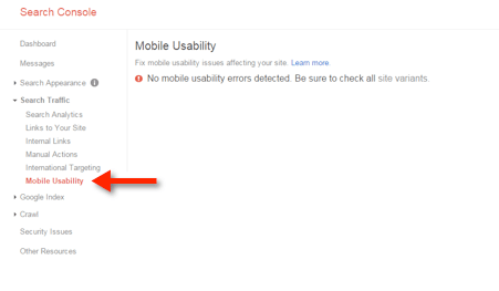
You can also check mobile-use problems using Google Webmaster Tools. If your site doesn’t already run Webmaster Tools, you’ll have to set it up and get verified, which can take a few days, before you can get started. You can set up your Google Webmaster Tools account here. If you’re already running Webmaster Tools, clicking the previous link will show your websites.
On the navigation bar on the left of the main screen, you’ll see the section “Mobile Usability.” Click there and it will give you a report that shows your website’s errors. It will list the errors at the bottom.
One more resource for learning about mobile friendly sites is Google’s Mobile Friendly Websites Guide.